The WPF Toolkit includes an AutoCompleteBox control. As the name suggests it is an autocomplete text box control. In this article we will show how to install the toolkit and how to use the AutoCompleteBox.
1. Install WPF Toolkit
The first step is to install the WPF Toolkit. You can download the installer or alternatively install it from the NuGet package manager within Visual Studio.

2. Reference the correct namespace
The AutoCompleteBox is in the System.Windows.Controls.Input.Toolkit.dll assembly. This means that you have to use the following namespace:
xmlns:toolkit="clr-namespace:System.Windows.Controls;assembly=System.Windows.Controls.Input.Toolkit"3. Add the AutoCompleteBox to the view
Suppose you have a view model like this:
public interface IYourViewModel
{
    IEnumerable<string> Names { get; }
    string SelectedName { get; set; }
}
You can then add the AutoCompleteBox control in this way:
<toolkit:AutoCompleteBox
    ItemsSource="{Binding Names}"
    SelectedItem="{Binding SelectedName, Mode=TwoWay}" />
Whenever the selection changes, the SelectedName property is updated.
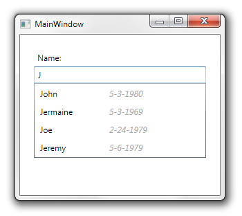
The result would be similar to the following:

4. Customize the AutoCompleteBox
Here are a couple of useful properties you will want to look at when customizing the user experience:
- IsTextCompletionEnabled: does the “autocomplete” part. If enabled, the first match will be selected automatically when the user starts typing.
- FilterMode: set the type of autocomplete, e.g.: StartsWith, Contains, Equals.
- MinimumPrefixLength: the minimum number of characters required before any suggestions are shown.
5. Using AutoCompleteBox with custom classes
Now let us consider you want to use custom objects instead of a collection of strings.
public class Person
{
    public DateTime Birthday { get; set; }
    public string Name { get; set; }
}
The view model doesn’t change much:
public interface IPeopleViewModel
{
    IEnumerable<Person> People { get; }
    Person SelectedPerson { get; set; }
}
When using the control you specify the ValueMemberPath or the ValueMemberBinding property to indicate which field will be used for the search and also for display in the text box portion.
<toolkit:AutoCompleteBox
    ItemsSource="{Binding People}"
    SelectedItem="{Binding SelectedPerson, Mode=TwoWay}"
    ValueMemberPath="Name"
    ItemTemplate="{StaticResource AutoCompleteBoxItemTemplate}" />
Because now we are using objects, we need to specify a template or else the ToString method of the object will be used for the display.
<DataTemplate x:Key="AutoCompleteBoxItemTemplate">
    <StackPanel Orientation="Horizontal">
        <Label
            Content="{Binding Name}"
            Width="100" />
        <Label
            Content="{Binding Birthday}"
            FontStyle="Italic"
            Foreground="DarkGray" />
    </StackPanel>
</DataTemplate>
In this example we just show the name followed by the birthday.
6. Search in multiple fields
Now you know how to use the AutoCompleteBox with objects, but you want to change the way the filtering is carried. You can do that by using the ItemFilter property, which expects a AutoCompleteFilterPredicate<object> delegate.
Assume that the Person class now has a FirstName and LastName property and that you want to search in both fields.
public class Person
{
    public DateTime Birthday { get; set; }
    public string Name { get; set; }
    public string FirstName { get; set; }
    public string LastName { get; set; }
}
You create the predicate in your view model:
public AutoCompleteFilterPredicate<object> PersonFilter
{
    get
    {
        return (searchText, obj) =>
            (obj as Person).FirstName.Contains(searchText)
            || (obj as Person).LastName.Contains(searchText);
    }
}
And then you set the property in the AutoCompleteBox:
<toolkit:AutoCompleteBox
    ItemsSource="{Binding People}"
    SelectedItem="{Binding SelectedPerson, Mode=TwoWay}"
    ValueMemberPath="Name"
    ItemTemplate="{StaticResource AutoCompleteBoxItemTemplate}"
    ItemFilter="{Binding PersonFilter}" />
Voilá!
